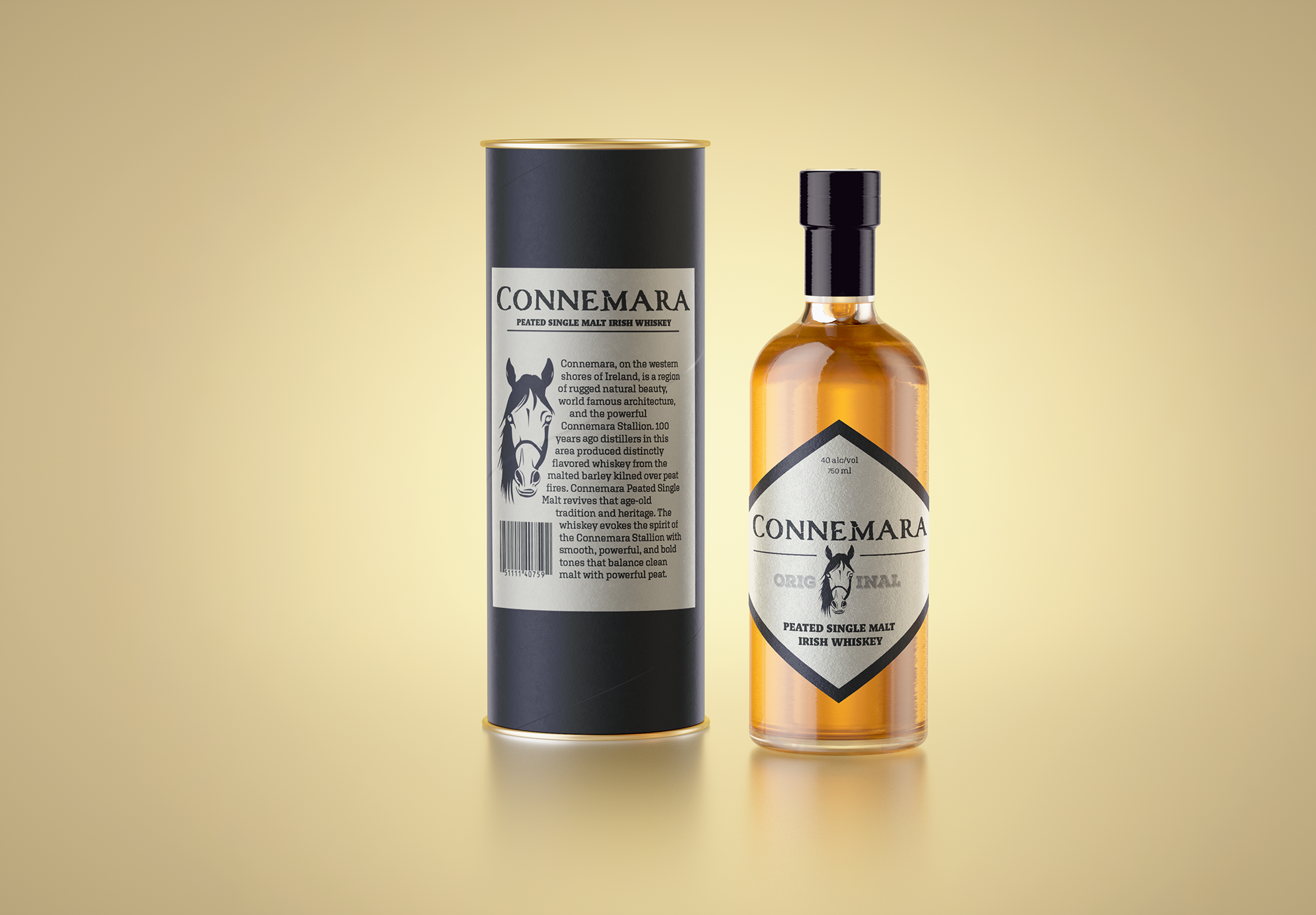
Original Design
Summary
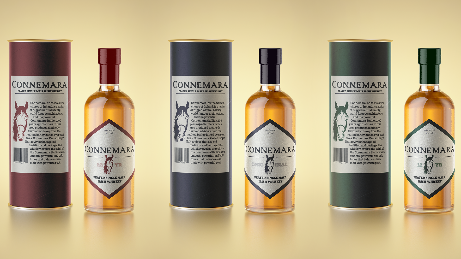
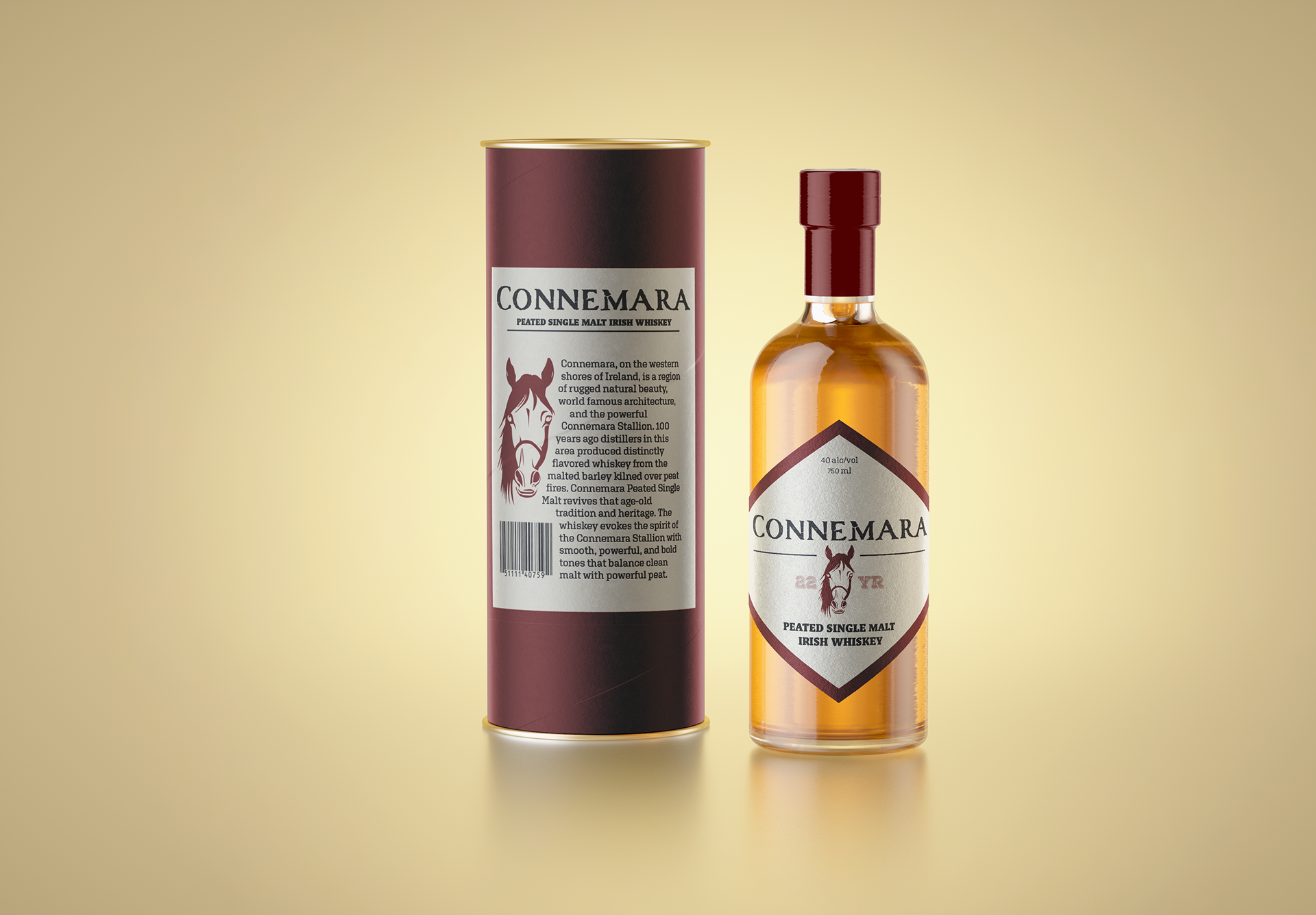
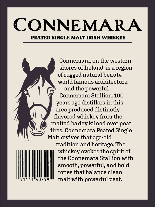
Connemara Whiskey, established in 1999, is the only peated Irish whiskey. A region in Ireland itself, Connemara is home to both Connemara National Park, which hosts a rugged landscape, and the Connemara Stallion which is a prestigious breed in equestrian sport. The current bottle design uses elements of the Connemara region arbitrarily, and the choices made do not reflect what is inside the bottle. This redesign uses the qualities of the Connemara Stallion to tell a story about what a customer can expect from the whiskey itself: something elegant, bold, rugged, and bred/refined to perfection for generations.
My Process
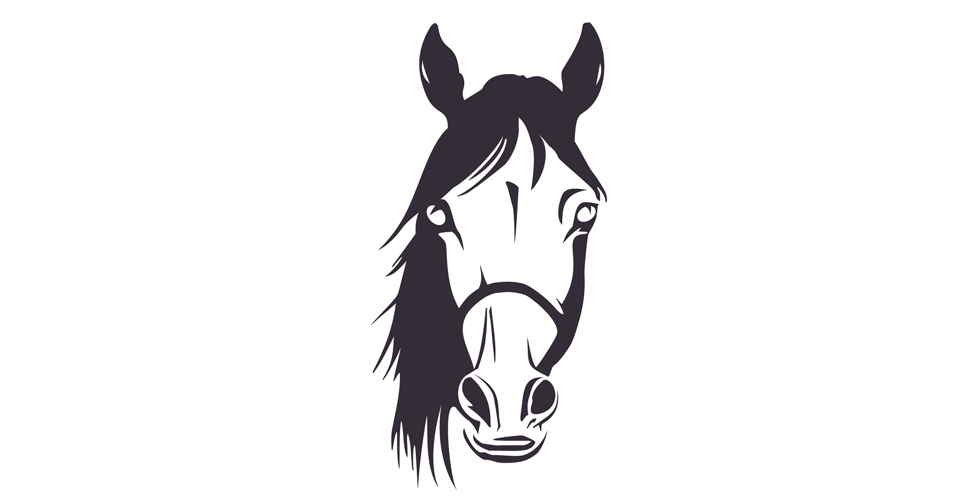
Before starting the design itself, I researched the Connemara region extensively. From my research, I made a mind-map to organize what I had learned into categories and themes. From this it was clear that the story of the Connemara Stallion packed a punch, and I decided to make that the focal point of the design. This choice was particularly strong because the Stallion embodied so much about the region. It was the perfect storytelling device because it felt as if every aspect spoke to characteristics in the whiskey itself.
Moving on to the design, I started by finding images of the Connemara Stallion to pull inspiration from. I looked for specific features in each picture that I wanted to incorporate into my final design. From here I moved to sketching to get those features on paper, and created a rough idea of what the Stallion would end up looking like.
Next, I moved to Adobe and used Illustrator’s generative AI to create a model of the horse with the features I desired. I edited the model to achieve the feeling I was aiming before arriving at the design used here in the final product.